The Pediatric Soft Tissue Sarcoma Paper, a COVID lock-down side quest and what is a genomic variant
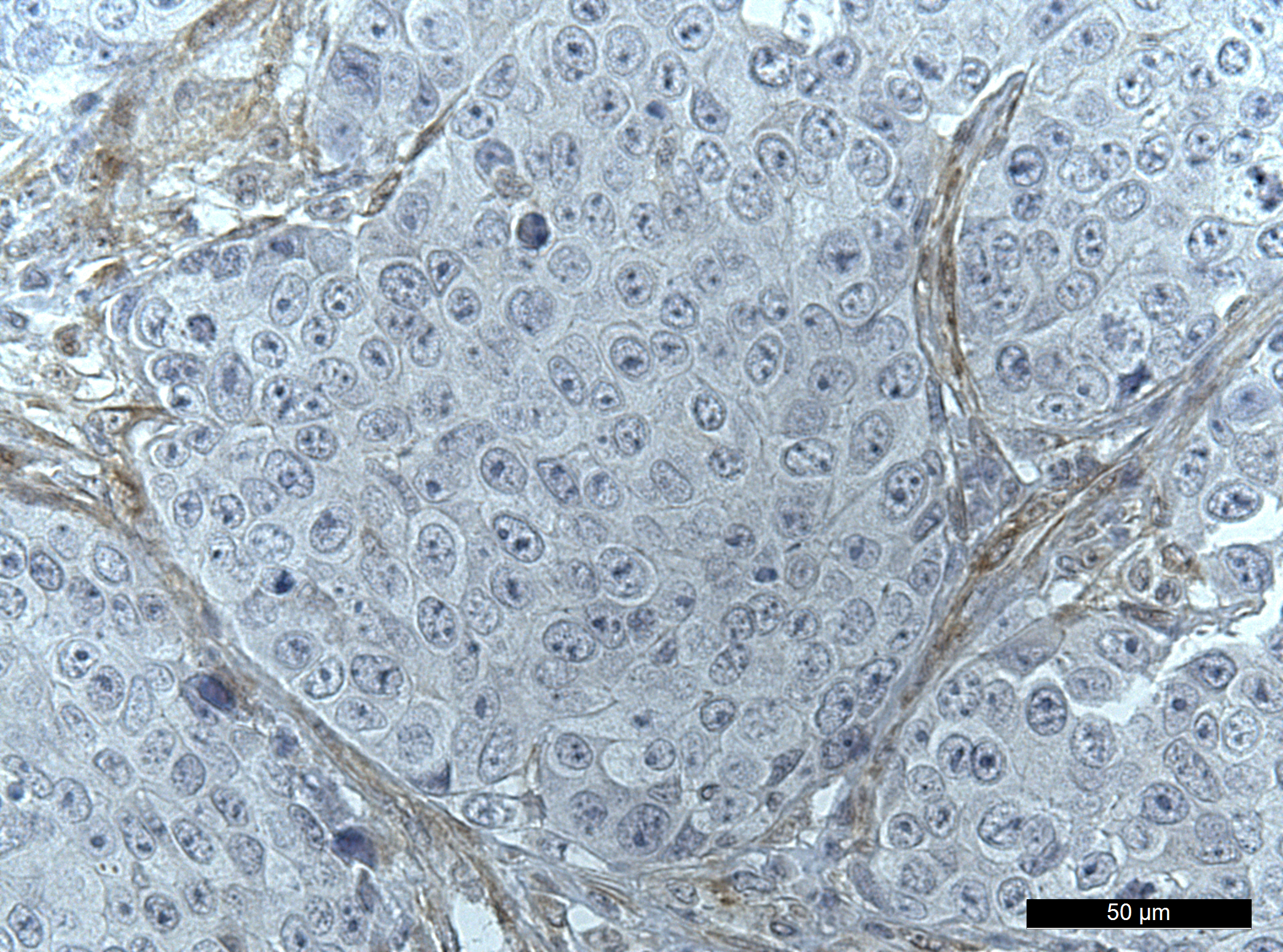
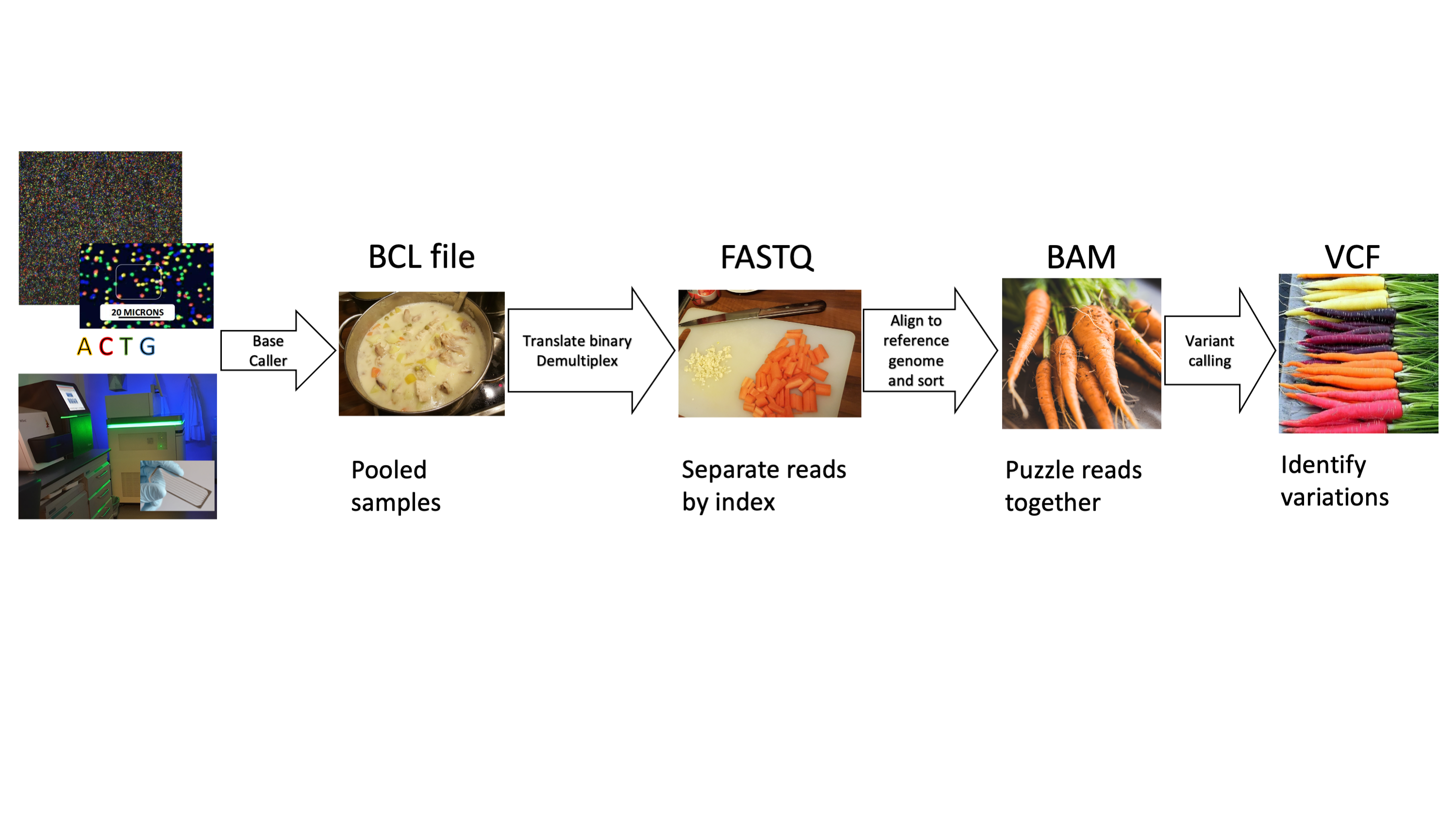
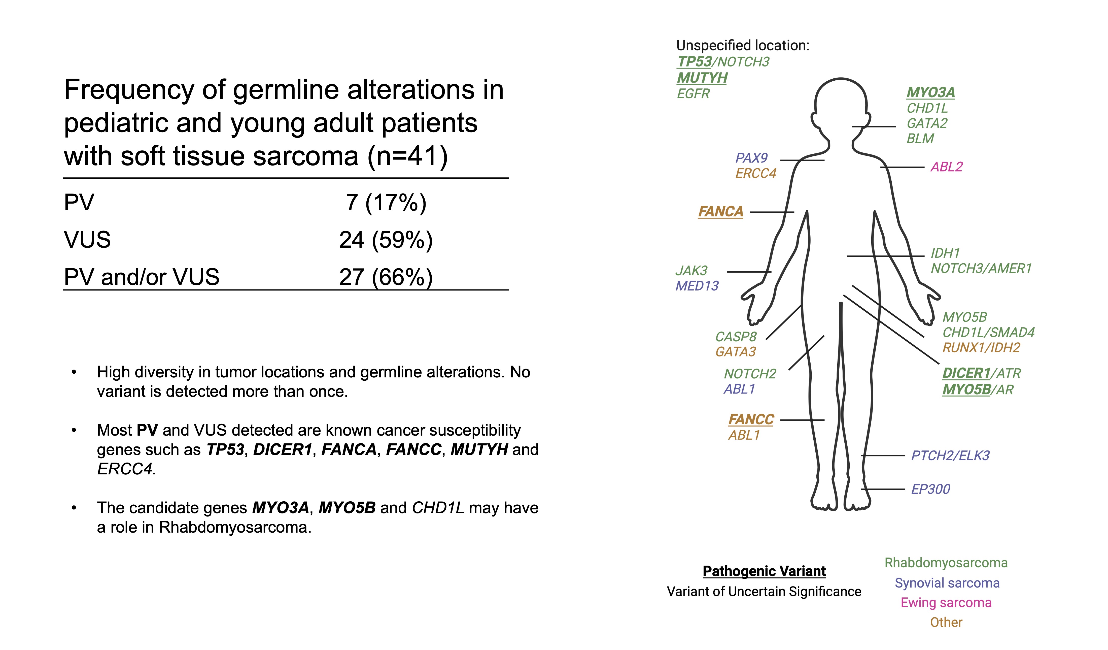
Our paper Germline variants in patients diagnosed with pediatric soft tissue sarcoma. was published during the summer. This paper began with the story of a young male with a sarcoma in the prostate. This is a very rare condition. The treating physician wanted to find better treatment options and in an attempt to get some clues to what, our lab did 360 gene panel DNA sequencing to see if there was any targetable mutations that could direct the treatment of this young man.