Plotting categorical values as a tiled chart
By Synnøve Yndestad in R Visualizations
June 5, 2022
Plotting your variables as a tiled map, can visualize interactions between them very efficiently.
Here is a “How to” plot categorical values as a tiled chart with fixed squares.
First, load tidyverse.
library(tidyverse)
Create a data set to plot.
df = data.frame(SubjectId = factor(LETTERS[1:20], levels = (LETTERS[1:20])))

df$Response = sample(x = c("CR", "PR", "SD", "PD"), size  = 20, replace = TRUE)
df$Response = factor(df$Response,levels = c("CR", "PR", "SD", "PD"))

df$Biomarker1 =  sample(x = c("High", "Medium", "Low"), size  = 20, replace = TRUE)
df$Biomarker1 = factor(df$Biomarker1, levels = c("High", "Medium", "Low"))

df$Biomarker2 =  sample(x = c("Present", "Absent"), size  = 20, replace = TRUE)
df$Biomarker2 = factor(df$Biomarker2, levels = c("Present", "Absent"))

head(df)
##   SubjectId Response Biomarker1 Biomarker2
## 1         A       CR       High    Present
## 2         B       PR       High     Absent
## 3         C       SD       High     Absent
## 4         D       SD     Medium     Absent
## 5         E       PR       High    Present
## 6         F       SD     Medium     Absent
Turn it into a long format by pivoting everything except “SubjectId”.
df.long = df %>% pivot_longer(cols = !SubjectId)
head(df.long)
## # A tibble: 6 × 3
##   SubjectId name       value
##   <fct>     <chr>      <fct>
## 1 A         Response   CR
## 2 A         Biomarker1 High
## 3 A         Biomarker2 Present
## 4 B         Response   PR
## 5 B         Biomarker1 High
## 6 B         Biomarker2 Absent
Add “SubjectId” and “name” as X and Y axis.
Use value as fill colour in tiles.
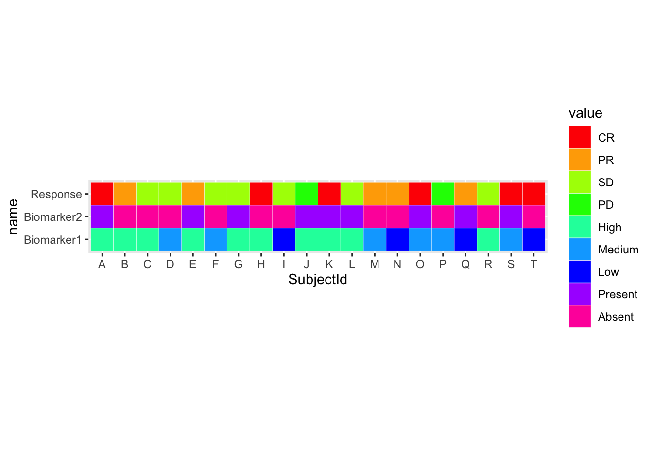
ggplot(df.long, aes(SubjectId, name)) +
  geom_tile(aes(fill = value))  +
  scale_fill_manual(values= rainbow (9))

Specifying colour within geom_tile() will add lines between the tiles.
Use coord_fixed() to turn the tiles into fixed squares.
ggplot(df.long, aes(SubjectId, name)) +
  geom_tile(aes(fill = value),
            colour = "white")  +
  scale_fill_manual(values= rainbow (9)) +
  coord_fixed()
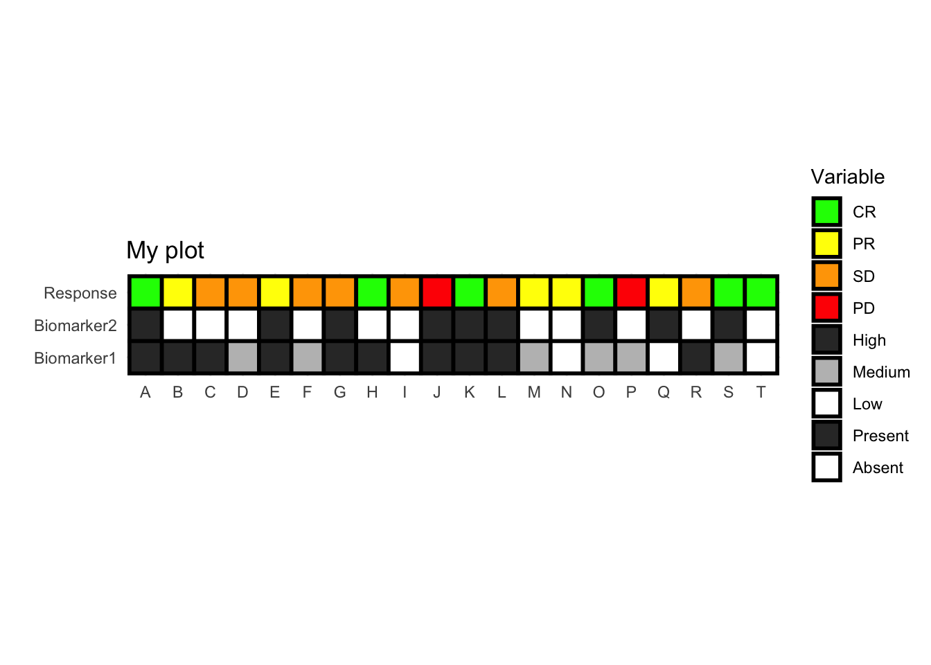
To change the colours individually, specify them in a vector and add the vector to scale_fill_manual().
my_cols = c("CR" = "green",
            "PR" = "yellow",
            "SD" = "orange",
            "PD" = "red",
            "High" = "grey20",
            "Medium" = "grey",
            "Low" = "white",
            "Present" = "grey20",
            "Absent" = "white")
Increase and change line-type by specifying colour, lwd (line width) and linetype within geom_tile().
Add or change the plot using standard ggplot syntax, and your plot is ready!
ggplot(df.long, aes(SubjectId, name)) +     # Specify data, x and y axis
   geom_tile(aes(fill = value),             # Specify what goes into the tile
                 colour = "black",          # Change line colour
                 lwd = 1,                   # Change line width
                 linetype = 1)  +           # Change line type
   scale_fill_manual(values= my_cols) +     # Change tile colours
   labs(fill = "Variable",                  # Change legend title
        title = "My plot") +                # Add title
   xlab("") +                               # Remove x axis label
   ylab("") +                               # Remove y axis label
   coord_fixed() +                          # Fix tile size
   theme_minimal()                          # Set theme for neater look, remove tick marks
- Posted on:
- June 5, 2022
- Length:
- 3 minute read, 445 words
- Categories:
- R Visualizations
- Tags:
- geom_tile() ggplot tidyverse