How to make a waterfall plot with ggpubr
By R package build in R Clinical science Visualizations
September 11, 2021
Results from clinical trials in oncology is often presented as a waterfall plot. The plot visualize how tumor growth is affected by treatment for each subject after a given time. It can communicate very effectively the overall results for an entire study using only one figure.
A waterfall plot is in essence a bar-chart ordered according to size. Each bar represents one subject and describes how much in % a tumor has changed from baseline (start of treatment), to the defined end of treatment.
When response is evaluated according to the
RECIST criteria, a patient has
Complete response = 100% disappearance of target lesions
Partial response = more than 30% decrease of target lesions
Stable disease = Regression less than 30% and increase less than 20% of target lesions
Progressive disease = more than 20% increase of target lesion growth.
So the X axis will cross the baseline at 0%, and the Y axis value will have a minimum value of -100% for Subjects that had Complete Response.
To make the plot, you first need to import your data to R in a tidy manner where variables are stored in columns, and subjects in rows.
Here is an example of a tidy table using data extracted from Table 2 in DOI:10.1016/j.annonc.2020.11.009. The first column is Subject IDs, followed by % Change from baseline, and some accompanying information regarding the biology of the tumor. The data is stored in my Rstudio environment as a data frame named “df.”
Since the waterfall plot is basically a barplot, you can use ggplot with geom_bar() to plot a bar chart. Only, in order to make it look publication-ready-pretty, it would require a lot of tweaking.
Plot the df with x= subject and y= % change from baseline using ggplot and geom_bar.
library(tidyverse)
ggplot(df, aes(x=Subject, y=Change_from_baseline, fill = HR_mutation)) +
  geom_bar(stat = "identity")

Well, this needs some work.
Nice plots communicates your point better. As an alternative to endlessly try to fix things to make the plot look pretty, we can use the
ggpubr package.
In the ggpubr vignette, they say: “The ‘ggpubr’ package provides some easy-to-use functions for creating and customizing ‘ggplot2’- based publication ready plots.”
They are not lying.
Ggpubr also conveniently contain various color-palettes from the
ggsci R package that corresponds to some of the major journals e.g.: “npg,” “aaas,” “nejm,” “lancet,” “jco,” “ucscgb,” “uchicago.” I am also amused that it contains color palettes from tv-shows like “startrek,” “futurama,” “tron,” “simpsons” and “rickandmorty.”
Start by loading the ggpubr library.
library(ggpubr)
Now plot the same df with ggpubrs ggbarplot with x= subject and y= % change from baseline, and in addition using HR mutational status as column fill value.
Since we have faith in our data, we will go for the NEJM color palette.
All options for ggbarplot() is listed here.
ggbarplot(df, x = "Subject", y = "Change_from_baseline",
          title = "% Change after 10 weeks of Olaparib",
          fill = "HR_mutation",                   # change fill color by HR status
          color = "white",                        # Set bar border colors to white
          palette = "nejm",                       # nejm journal color palette
          sort.val = "desc",                      # Sort the value in descending order
          sort.by.groups = FALSE,                 # Don't sort inside each group
          x.text.angle = 90,                      # Rotate vertically x axis texts
          ylab = " % Change from baseline",       # Change y-aksis label
          legend.title = "HR status"              # Add legend title
          )
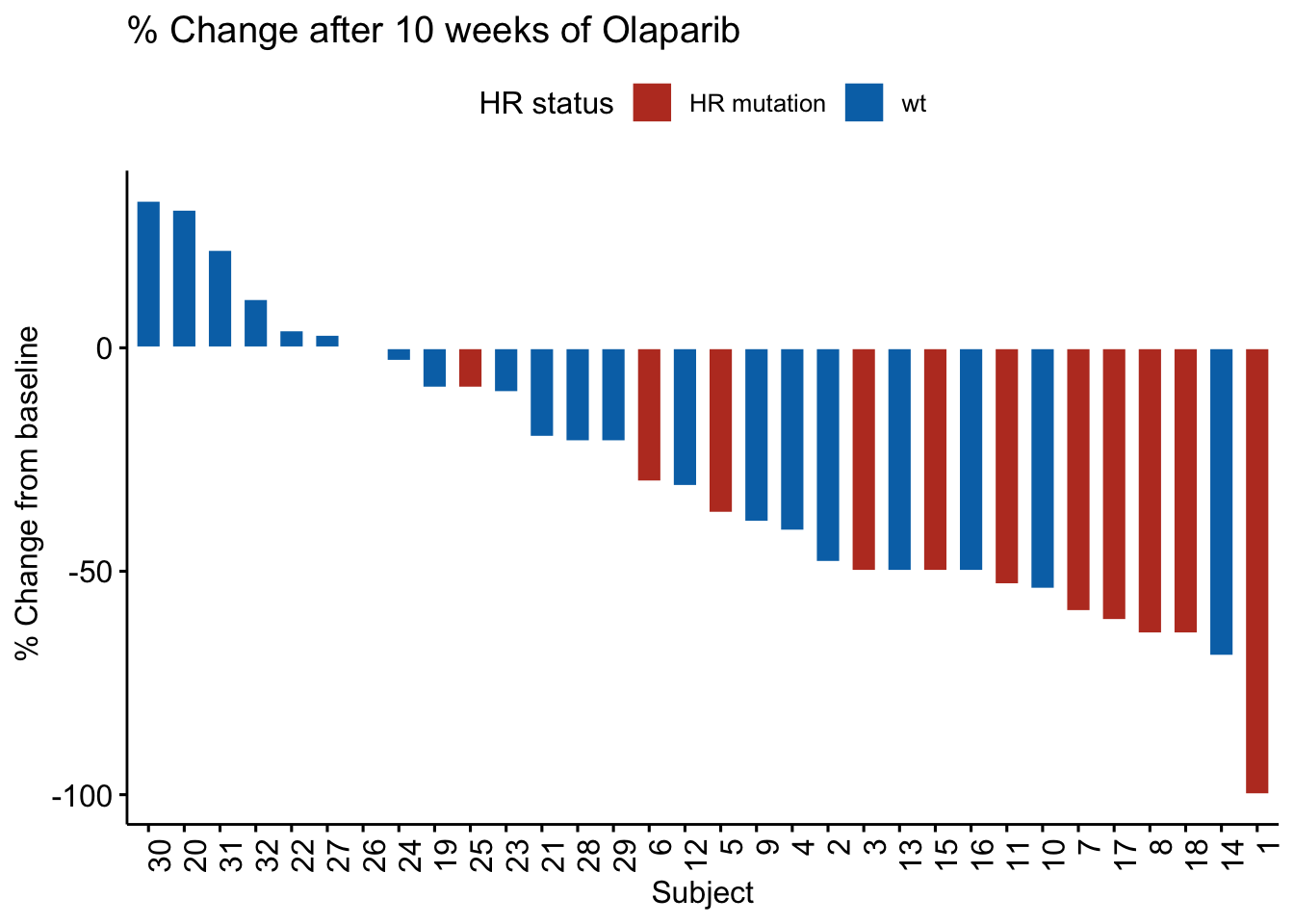
This plot just looks great, using practically out of the box default settings.
Negative values indicates that the tumor size is shrinking, and glimpsing quickly at the figure, it gives an impression that most of the patients has some benefit to treatment after 10 weeks of olaparib. The red bars are most frequently found at the right side with the biggest negative tumor growth, indicating that tumors with HR mutations are more sensitive to Olaparib treatment.
Then, lets say we wanted to use the JCO color palette in stead. Then replace “njem” with “jco” when specifying palette.
Other elements can be added and adjusted just as in a ordinary ggplot. I.e. you can add intercept lines to highlight borders for PR and SD, you might want to add a geom_text() to annotate features, and adjust the Y axis using scales like in a normal ggplot.
ggbarplot(df, x = "Subject", y = "Change_from_baseline",
          fill = "HR_mutation",                   # Change fill color by HR status
          color = "white",                        # Set bar border colors to white
          palette = "jco",                        # jco journal color palette. see ?ggpar
          sort.val = "desc",                      # Sort the value in descending order
          sort.by.groups = FALSE,                 # Don't  sort inside each group
          x.text.angle = 45,                      # Rotate vertically x axis texts
          ylab = " % Change from baseline",       # Change y-aksis label
          legend.title = ""                       # Add or change legend title
          )  +

  geom_hline(yintercept= -30, linetype="dashed", color = "red") +  # Add a red dashed line at y=-30  Below = PR
  geom_hline(yintercept= 20, linetype="dashed", color = "red") +   # Add a red dashed line at y= 20  Above = PD
  geom_text(aes(label = BRCA1_methylation,                         # Add text from columns values
                  x = Subject,
                  y = -90),
                  size = 2.5,
                  angle = 90) +
  scale_y_continuous(breaks = scales::breaks_width(10))            # Edit y-axis numbering
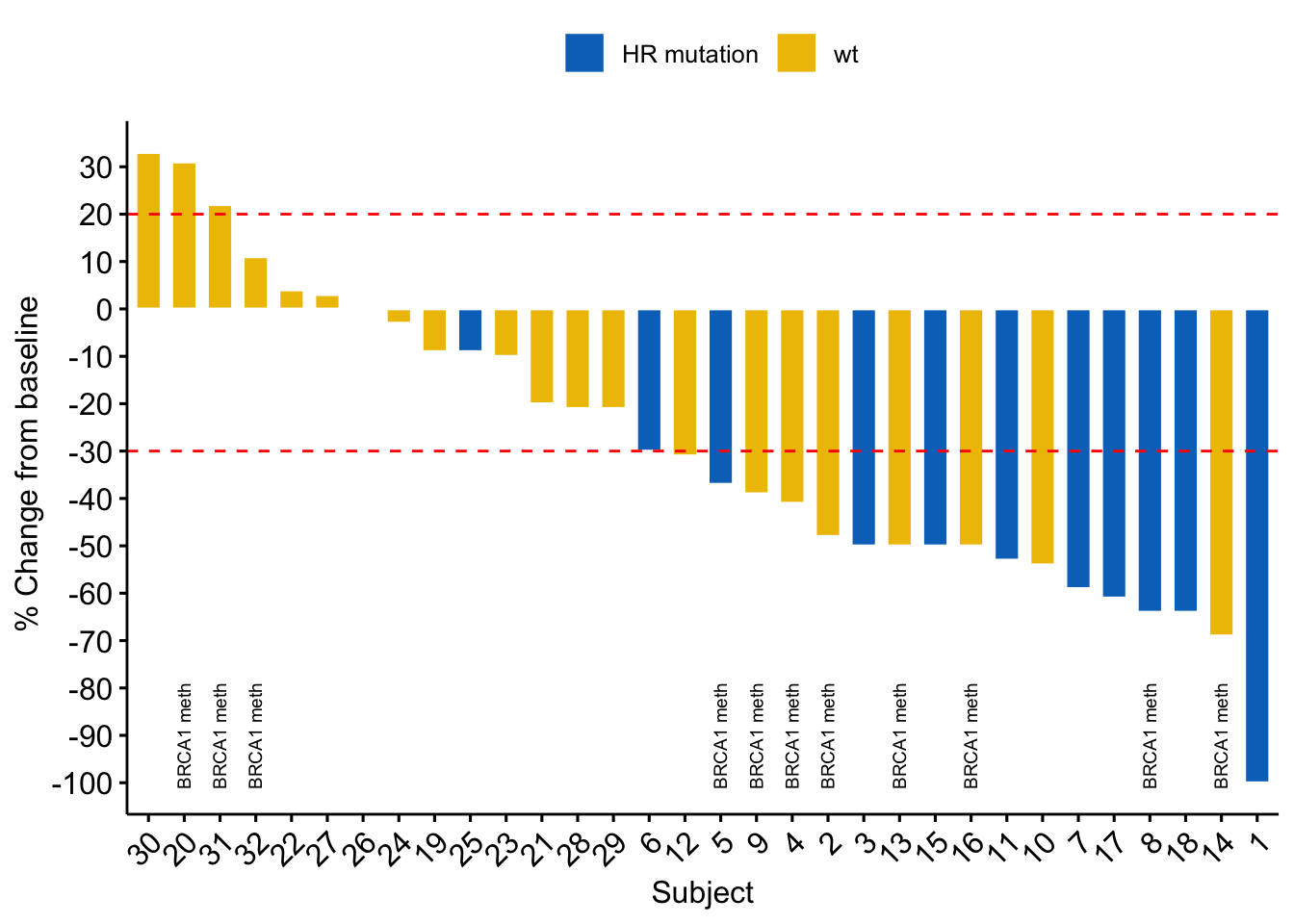
Also an awesome plot.
Now, would be a good place to stop.
Adding more features, maybe some fancy fonts, is fun and very tempting while you are at it. Adding more can decrease readability and your message may be lost in the noise. So just don´t over do it.
library(extrafont)
loadfonts()

ggbarplot(df, x = "Subject", y = "Change_from_baseline",
          fill = "HR_mutation",                   # Change fill color by HR status
          color = "black",                        # Set bar border colors to black
          palette = "rickandmorty",               # rickandmorty color palette.
          sort.val = "desc",                      # Sort the value in descending order
          sort.by.groups = TRUE,                  # DO sort inside each group
          x.text.angle = 45,                      # Rotate vertically x axis texts
          ylab = " % Change from baseline",       # Change y-label
          title = "The Too Much Plot",
          subtitle = "Know when to stop",
          legend.title = "Alteration"  ,          # Add or change legend title
          )  +
      theme(plot.title    = element_text(family = "QuirkyRobot", size =40),
            plot.subtitle = element_text(family = "MetalLord", size =20),
            axis.title.x  = element_text(family = "PlainOldHandwriting", size = 20),
            axis.title.y  = element_text(family = "AstronBoy", size = 15),
            axis.text.x   = element_text(family = "PlainOldHandwriting"),
            axis.text.y   = element_text(family = "goingtodogreatthings"))+

      geom_hline(yintercept= -30, linetype="dashed", color = "red") +  # Add dashed line at y=-30  Below = PR
      geom_hline(yintercept= 20, linetype="dashed", color = "red") +   # Add dashed line at y= 20  Above = PD
      geom_text(aes(label = Germline_Hrmut,  x = Subject,  y = 25),    # Add text from columns values
                  size = 2.5,
                  angle = 90,
                  color = "green",
                  family ="BiometricJoe") +
      geom_text(aes(label = BRCA1_methylation,                         # Add text from columns values
                  x = Subject,
                  y = Change_from_baseline-20),
                  size = 2.5,
                  angle = 90,
                  color = "orange", family = "PrinceValiant")+
      geom_segment(aes(x = "10", y = -80, xend = "10", yend = -70), arrow = arrow(length = unit(0.2, "cm"))) +     #Add arrow

      scale_y_continuous(breaks = scales::breaks_width(10), limits = c(NA, 50))     # Edit y-axis numbering and limits

dev.off()
## null device
##           1
- Posted on:
- September 11, 2021
- Length:
- 6 minute read, 1228 words
- Categories:
- R Clinical science Visualizations