Plotting bar charts in R, geom_bar vs geom_col
By Synnøve Yndestad in R Visualizations
October 13, 2022
Plotting bar charts in R, geom_bar vs geom_col
Plotting the Nightingale data made me realize that there are more to plotting a bar chart than than first meets the eye.
While a histogram visualize the distribution of a numerical variable, a bar plot visualize the relationship between a categorical variable and a numerical variable.
ggplot has two functions for plotting bar charts, geom_bar and geom_col.
In short:
geom_bar() -> Counts Categorical units, no y input
geom_col() -> Plot the Numeric value, need numerical y input
By default, geom_bar() counts the number of occurrences for each level of a categorical variable.
This makes the height of the bar equal to the number of cases in each level.
The default setting in geom_bar() is stat = "count", position = "stack". Thereby, calling the default setting geom_bar() in a ggplot will stack each count in the bar on top of each other.
I will demonstrate with the Palmer penguins data set.
library(tidyverse)
library(palmerpenguins)
data("penguins")
# Remove missing values
(penguins = penguins %>% na.omit())
## # A tibble: 333 × 8
##    species island    bill_length_mm bill_depth_mm flipper_length_mm body_mass_g
##    <fct>   <fct>              <dbl>         <dbl>             <int>       <int>
##  1 Adelie  Torgersen           39.1          18.7               181        3750
##  2 Adelie  Torgersen           39.5          17.4               186        3800
##  3 Adelie  Torgersen           40.3          18                 195        3250
##  4 Adelie  Torgersen           36.7          19.3               193        3450
##  5 Adelie  Torgersen           39.3          20.6               190        3650
##  6 Adelie  Torgersen           38.9          17.8               181        3625
##  7 Adelie  Torgersen           39.2          19.6               195        4675
##  8 Adelie  Torgersen           41.1          17.6               182        3200
##  9 Adelie  Torgersen           38.6          21.2               191        3800
## 10 Adelie  Torgersen           34.6          21.1               198        4400
## # ℹ 323 more rows
## # ℹ 2 more variables: sex <fct>, year <int>
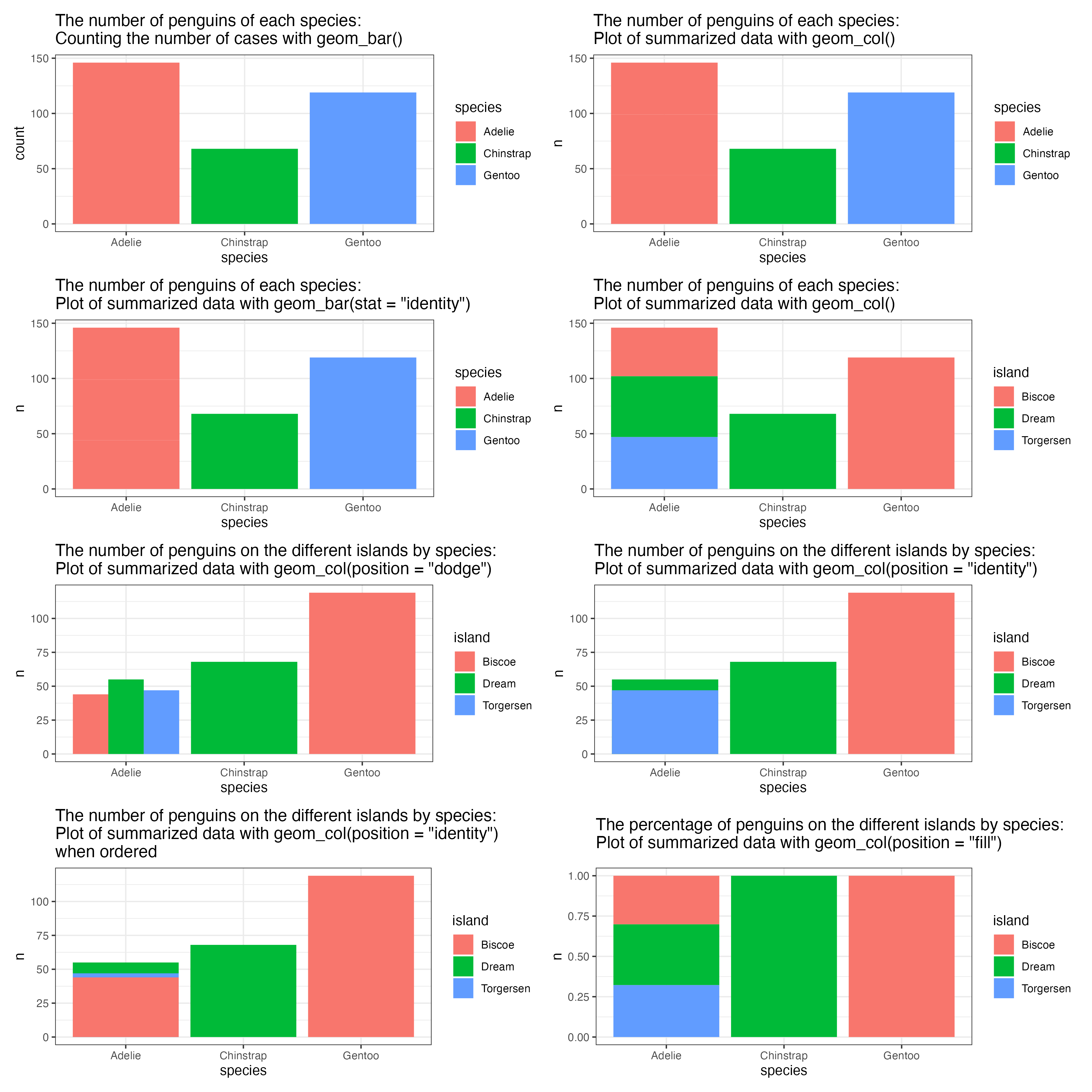
Count and plot the number of each species of penguins with geom_bar():
penguins %>%
ggplot(aes(x = species, fill = species)) +
  geom_bar() +
  theme_bw() +
  ggtitle("The number of penguins of each species: \nCounting the number of cases with geom_bar()")
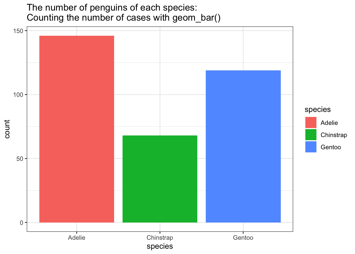
geom_col() uses the numerical values in the data for the height of the bars, and is useful for when you have already summarized the data.
# Summarize the data
penguins_summarized =   penguins %>% group_by(species) %>%
                                     count(island)
penguins_summarized
## # A tibble: 5 × 3
## # Groups:   species [3]
##   species   island        n
##   <fct>     <fct>     <int>
## 1 Adelie    Biscoe       44
## 2 Adelie    Dream        55
## 3 Adelie    Torgersen    47
## 4 Chinstrap Dream        68
## 5 Gentoo    Biscoe      119
Use geom_col() to plot the summarized data:
penguins_summarized %>%
ggplot(aes(x = species, y = n, fill = species )) +
  geom_col() +
  theme_bw() +
  ggtitle("The number of penguins of each species: \nPlot of summarized data with geom_col()")

geom_col() == geom_bar(stat = “identity”)
You can use geom_bar() for numerical values too if you specify stat = "identity" within geom_bar().
If you change geom_bar() to geom_bar(stat = "identity"), it will take a numerical input and perform identical to the geom_col() function. Then you will also need to specify y in the aes call.
geom_bar(stat = "identity") = Numerical
penguins_summarized %>%
ggplot(aes(x = species, y = n, fill = species )) +
  geom_bar(stat = "identity") +
  theme_bw() +
  ggtitle("The number of penguins of each species: \nPlot of summarized data with geom_bar(stat = \"identity\")")

position = “stack”
geom_col() stacks the levels on top or each other, and has position = "stack" set as default.
This can be visualized by adding the islands as fill.
penguins_summarized %>%
ggplot(aes(x = species, y = n, fill = island )) +
  geom_col() +
  theme_bw() +
  ggtitle("The number of penguins of each species: \nPlot of summarized data with geom_col()")
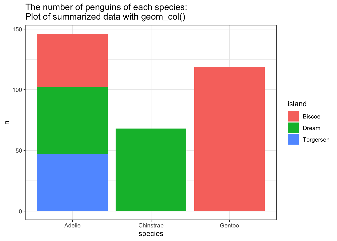
position = “dodge”
If you want the columns next to each other, you need to specify position = "dodge".
penguins_summarized %>%
ggplot(aes(x = species, y = n, fill = island )) +
  geom_col(position = "dodge") +
  theme_bw() +
  ggtitle("The number of penguins on the different islands by species:  \nPlot of summarized data with geom_col(position = \"dodge\")")
position = “identity”
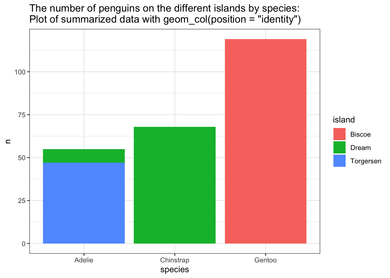
If you change position to “identity”, the columns will “un-stack” and be plotted in front of each other. Be aware that this may hide some of your data. Where did the penguins from the Biscoe island go in the Adelie group?
penguins_summarized %>%
ggplot(aes(x = species, y = n, fill = island )) +
  geom_col(position = "identity") +
  theme_bw() +
  ggtitle("The number of penguins on the different islands by species:  \nPlot of summarized data with geom_col(position = \"identity\")")
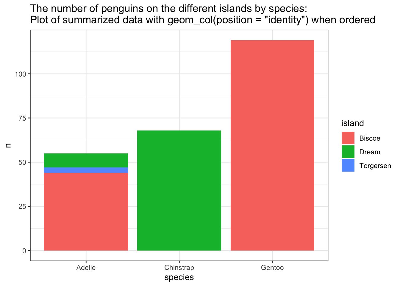
By arranging the count in descending order with arrange(desc(n)), the smallest group will be plotted in front, and all will be visible.
penguins_summarized %>%
  arrange(desc(n)) %>%
ggplot(aes(x = species, y = n, fill = island )) +
  geom_col(position = "identity") +
  theme_bw() +
  ggtitle("The number of penguins on the different islands by species:  \nPlot of summarized data with geom_col(position = \"identity\") when ordered")
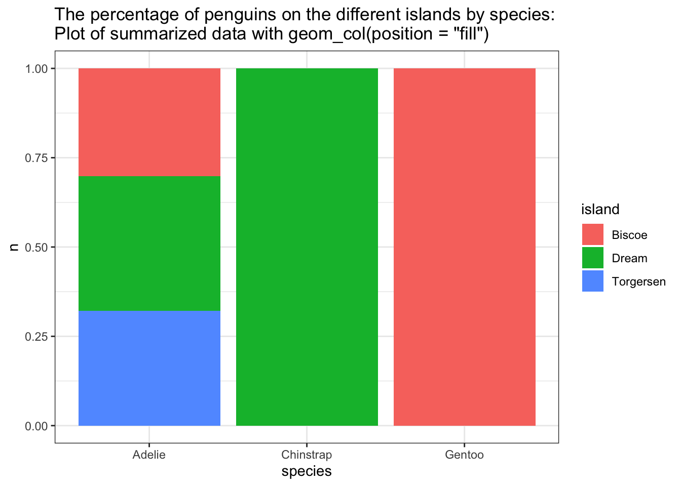
position = “fill”
Changing the position to “fill” will plot a percent stacked barplot
penguins_summarized %>%
ggplot(aes(x = species, y = n, fill = island )) +
  geom_col(position = "fill") +
  theme_bw() +
  ggtitle("The percentage of penguins on the different islands by species: \nPlot of summarized data with geom_col(position = \"fill\") ")
Summary:
geom_bar() -> Counts Categoricals, do not need y
geom_col() -> Plot the Numeric value, need y
geom_bar(stat = “identity”) -> Plot the Numeric value, need y
geom_col() == geom_bar(stat = “identity”)
position = “dodge” -> split the stack and puts the columns next to each other
position = “identity” -> split the stack and puts the columns behind each other
position = “fill” -> makes a percent stacked bar plot