Plot coxcomb diagrams like Florence Nightingale
By Synnøve Yndestad in R Statistics Visualizations Clinical science
October 13, 2022
Florence Nightingale (1820-1910) is best known as a pioneer in modern nursing, but she was also a pioneer in statistics and the use of statistical graphics in data analysis. In her work during the Crimean War, she tended to the wounded soldiers in the hospitals and helped to improve the conditions in which they were treated. She collected data on patients and their outcomes, and used a coxcomb diagram to visually display the causes of death in soldiers.
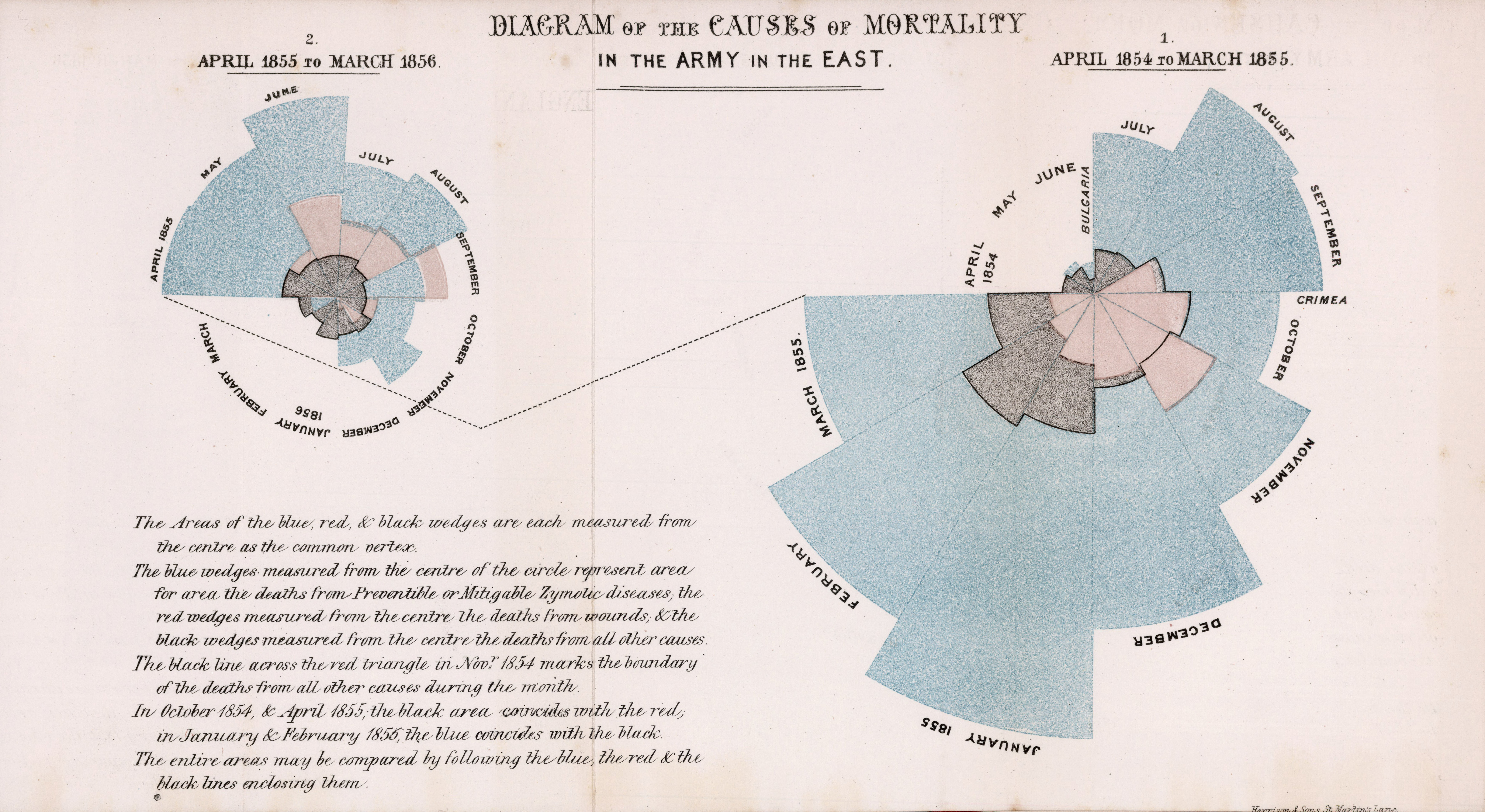
Nightingales coxcomb plot “Diagram of the Causes of Mortality in the Army in the East” illustrated that the main cause of death among the British troops in the Crimean War was preventable disease rather than injuries from fighting. The plot also shows that the death rate decreased when a Sanitary Commissioner arrived to aid in improving hygiene and sanitation. The coxcomb plot was later used by Nightingale to lobby for improved sanitation and hygiene in hospitals. This eventually led to a reduction in the death rate from disease in hospitals. She was a firm believer that statistical data presented as charts and diagrams is a powerful tool to make complex data more understandable. It help people see relationships between data and enables us to make informed decisions.
I wanted to recreate Nightingales historical plot using R, and at the same time give a tutorial on “How to” make a coxcomb/polar-area plot/rose diagram'
The HistData package contains a number of interesting data sets that are important in the history of statistics and data visualization. This includes the data for the coxcomb diagram.
## Load the Nightingale data from the HistData package
library(tidyverse)
library(HistData)
data(Nightingale)
head(Nightingale)
##         Date Month Year  Army Disease Wounds Other Disease.rate Wounds.rate
## 1 1854-04-01   Apr 1854  8571       1      0     5          1.4         0.0
## 2 1854-05-01   May 1854 23333      12      0     9          6.2         0.0
## 3 1854-06-01   Jun 1854 28333      11      0     6          4.7         0.0
## 4 1854-07-01   Jul 1854 28722     359      0    23        150.0         0.0
## 5 1854-08-01   Aug 1854 30246     828      1    30        328.5         0.4
## 6 1854-09-01   Sep 1854 30290     788     81    70        312.2        32.1
##   Other.rate
## 1        7.0
## 2        4.6
## 3        2.5
## 4        9.6
## 5       11.9
## 6       27.7
We need the data to be in a long format for plotting.
Select the necessary variables, and pivot longer.
Nightingale.l = Nightingale %>%
                select(Date, Month, Disease:Other) %>%
           pivot_longer(cols = Disease:Other,
           names_to = "Cause of Death",
           values_to = "Count")
Nightingale.l
## # A tibble: 72 × 4
##    Date       Month `Cause of Death` Count
##    <date>     <ord> <chr>            <int>
##  1 1854-04-01 Apr   Disease              1
##  2 1854-04-01 Apr   Wounds               0
##  3 1854-04-01 Apr   Other                5
##  4 1854-05-01 May   Disease             12
##  5 1854-05-01 May   Wounds               0
##  6 1854-05-01 May   Other                9
##  7 1854-06-01 Jun   Disease             11
##  8 1854-06-01 Jun   Wounds               0
##  9 1854-06-01 Jun   Other                6
## 10 1854-07-01 Jul   Disease            359
## # … with 62 more rows
The coxcomb plot is basically a bar plot in a circle wrapped with coord_polar() in a ggplot.
This is how the data would appear using a standard barchart.
Nightingale.l %>%
  ggplot(aes(x = as.character(Date), y = Count, fill = `Cause of Death`)) +
  geom_col(position = "dodge")  +
  labs(x = "") +
  ggtitle("Causes of Mortality in the Army in the East") +
  theme_classic()+
  theme(axis.text.x = element_text(angle = 90, vjust = 0.5, hjust=1))
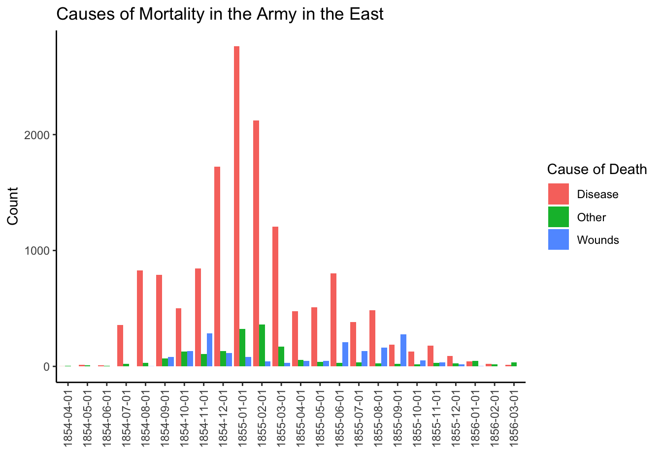
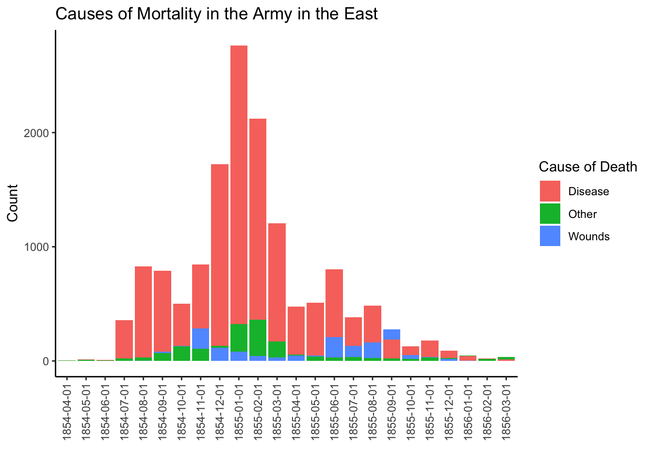
But in Nightingales coxcomb plot, the bars are positioned in front of each other.
This is achieved by setting geom_col(position = "identity")
To avoid that the smaller bars are hidden behind the taller ones, we need to arrange the counts in descending order before plotting.
Nightingale.l %>%
  arrange(desc(Count)) %>%  ## Arrange the counts in descending order
                            ## so the smallest bar does not get hidden behind taller ones
  ggplot(aes(x = as.character(Date), y = Count, fill = `Cause of Death`)) +
  geom_col(position = "identity")  +
  labs(x = "") +
  ggtitle("Causes of Mortality in the Army in the East") +
  theme_classic()+
  theme(axis.text.x = element_text(angle = 90, vjust = 0.5, hjust=1))
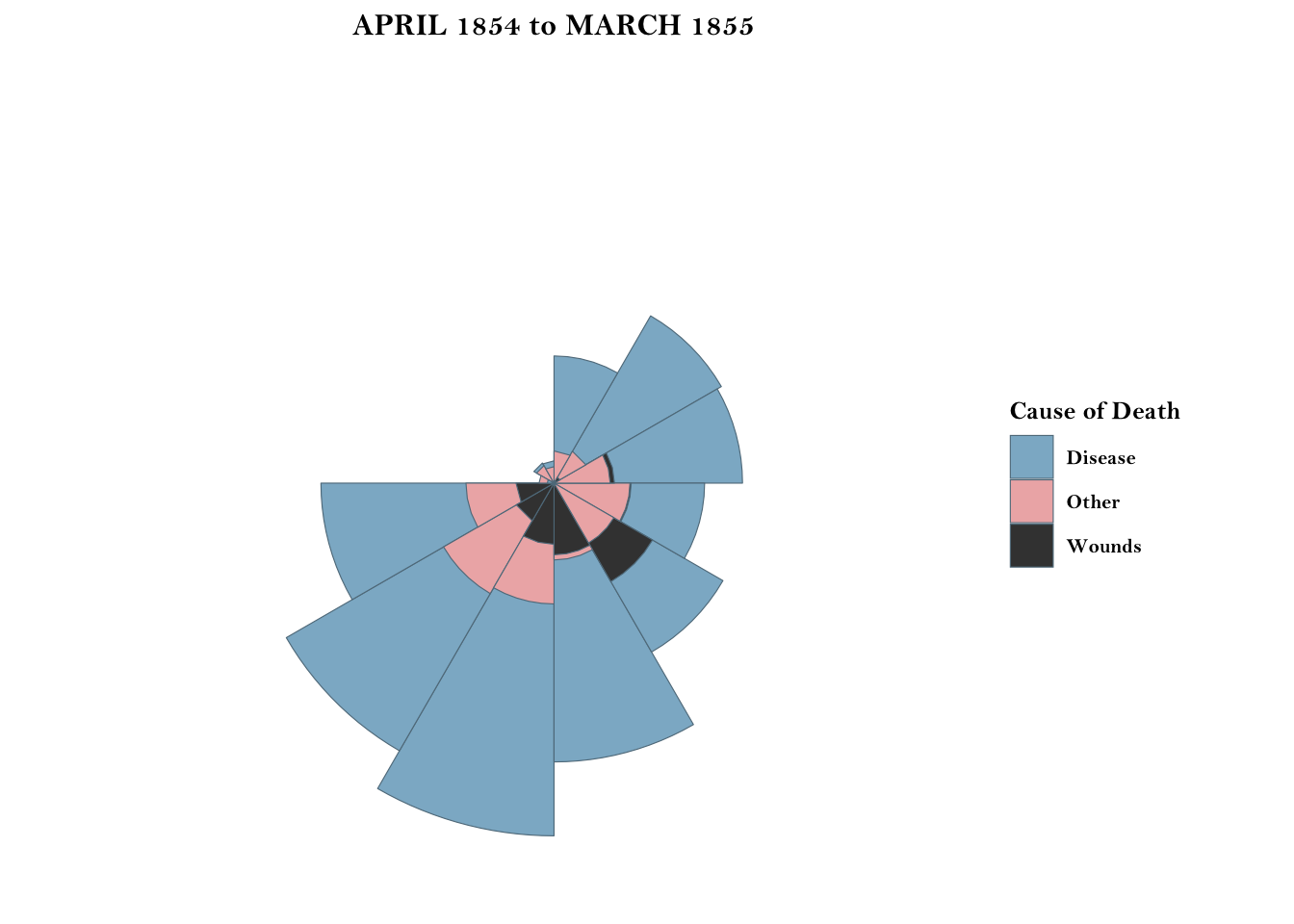
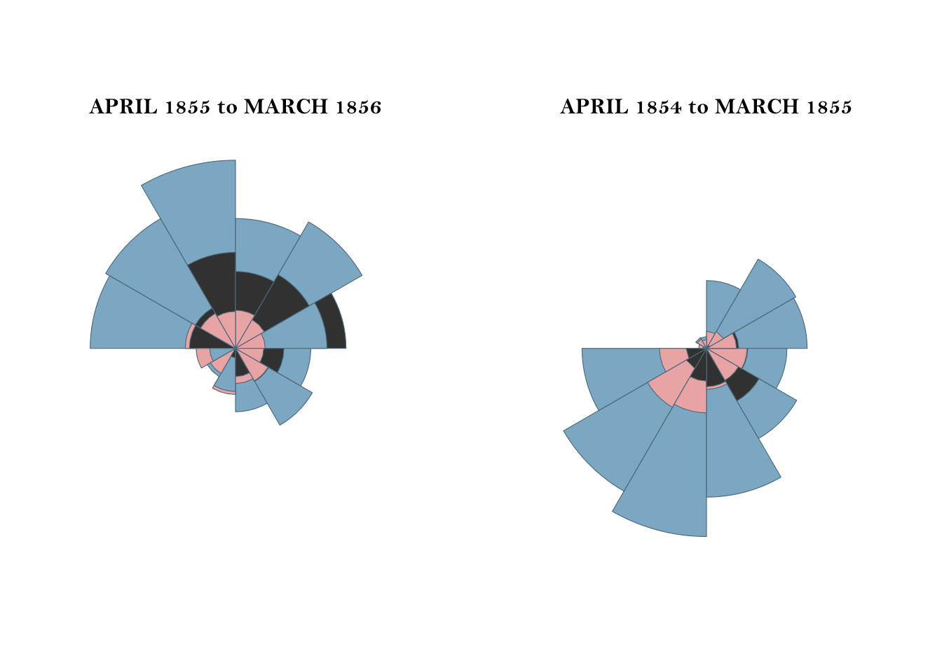
Now that we understand how the bar chart works, we can put everything together.
We need to make two plots. One before, and one after the Sanitary Commissioners arrived.
Subset by date, and arrange by count while calling ggplot.
Add coord_polar() to wrap the bar chart in a circle.
Use scale_y_sqrt() and specify start=3*pi/2 within coord_polar() to keep the bar area proportional when wrapped in a circle.
p1 = Nightingale.l %>%
## Subset the dates before Sanitary Commissioners arrived
subset(Date < as.Date("1855-04-01")) %>%
## Arrange the counts in descending order
## so the smaller bars does not get hidden behind taller ones
arrange(desc(Count)) %>%
## Now the plot
ggplot(aes(x = as.character(Date), y = Count, fill = `Cause of Death`)) +
## Add width = 1 for the column to close the gap.
## Add come color and define the size of the line
geom_col(width = 1, position="identity", color="lightskyblue4", size=0.2) +
## Add pretty colors
scale_fill_manual(values =c("lightskyblue3", "rosybrown2", "grey25"))+
## Scale the y axsis for correct proportions
scale_y_sqrt()+
## Make it a circle, and keep the area proportional
coord_polar(start=3*pi/2) +
## Add title
ggtitle("APRIL 1854 to MARCH 1855") +
## Remove stuff
theme_void() +
## Specify font imported by extrafont
theme(text=element_text(size=10, family="BellMTBold")) +
## Center the title
theme(plot.title = element_text(hjust = 0.5))
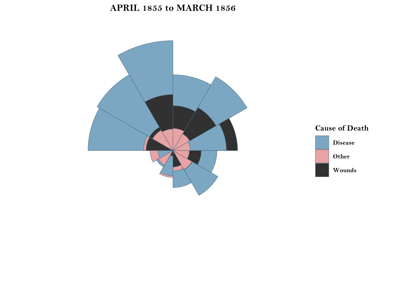
p1
Now the APRIL 1855 to MARCH 1856 plot:
p2 = Nightingale.l %>%
              subset(Date >= as.Date("1855-04-01")) %>%
              arrange(desc(Count)) %>%
  ggplot(aes(x = as.character(Date), y = Count, fill = `Cause of Death`)) +
  geom_col(width = 1, position="identity", color="lightskyblue4", size=0.2)  +
  scale_fill_manual(values =c("lightskyblue3", "rosybrown2", "grey25"))+
  scale_y_sqrt()+
  coord_polar(start=3*pi/2) +
  ggtitle("APRIL 1855 to MARCH 1856") +
  theme_void() +
  theme(text=element_text(size=10,  family="BellMTBold")) +
  theme(plot.title = element_text(hjust = 0.5))


p2
Use cowplot to combine the two separate plots, and to add the title and diagram text.
library(cowplot)
Combine the two plots with plot_grid()
plot_row =cowplot::plot_grid(p2 + theme(legend.position="none"),
                             p1 + theme(legend.position="none"))

plot_row
Now, add the title and the diagram text with ggdraw() and draw_label() from cowplot.
# Add the title
title <- ggdraw() +
  draw_label(
    "DIAGRAM of the CAUSES of MORTALITY",
    fontfamily = "Cardinal Regular",
    x = 0.25,
    hjust = 0
  ) +
  theme(
    # add margin on the left of the drawing canvas,
    plot.margin = margin(0, 0, 0, 7)
  )
## Add subtitle
title2 <- ggdraw() +
  draw_label(
    "IN the ARMY in the EAST",
    fontfamily = "Arial",
    size = 12,
    x = 0.3,
    hjust = -0.35
  )
Add the diagram text
subText <- ggdraw() +
  draw_label(
    "The Areas of the blue, red, & black wedges are each measured from the centre as the common vertex.\nThe blue wedges measured from the centre of the circle represent area for area the deaths from Preventable or Mitigable Zymotic diseases,\nthe red wedges measured from the centre the deaths from wounds, & the black wedges measured from the centre the deaths from all other causes.\nThe black line across the red triangle in Nov. 1854 marks the boundary of the deaths from all other causes during the month.\nIn October 1854, & April 1855, the black area coincides with the red,in January & February 1856, the blue coincides with the black. \nThe entire areas may be compared by following the blue, the red, & the black lines enclosing them.",
    fontfamily = "SnellRoundhand",
    size = 10,
    x = 0,
    hjust = 0
  ) +
  theme(
    # so title is aligned with left edge of first plot
    plot.margin = margin(0, 0, 0, 7)
  )
Put all the elements together with plot_grid(), and save the plot while adding background color.
plot_grid(
          title,
          title2,
          plot_row,
          subText,
  ncol = 1,
  # rel_heights values control the relative height of the elements
  rel_heights = c(1,1.1,8,2.7)
)
ggsave("NightingaleCoxcombInR.png", bg='seashell')
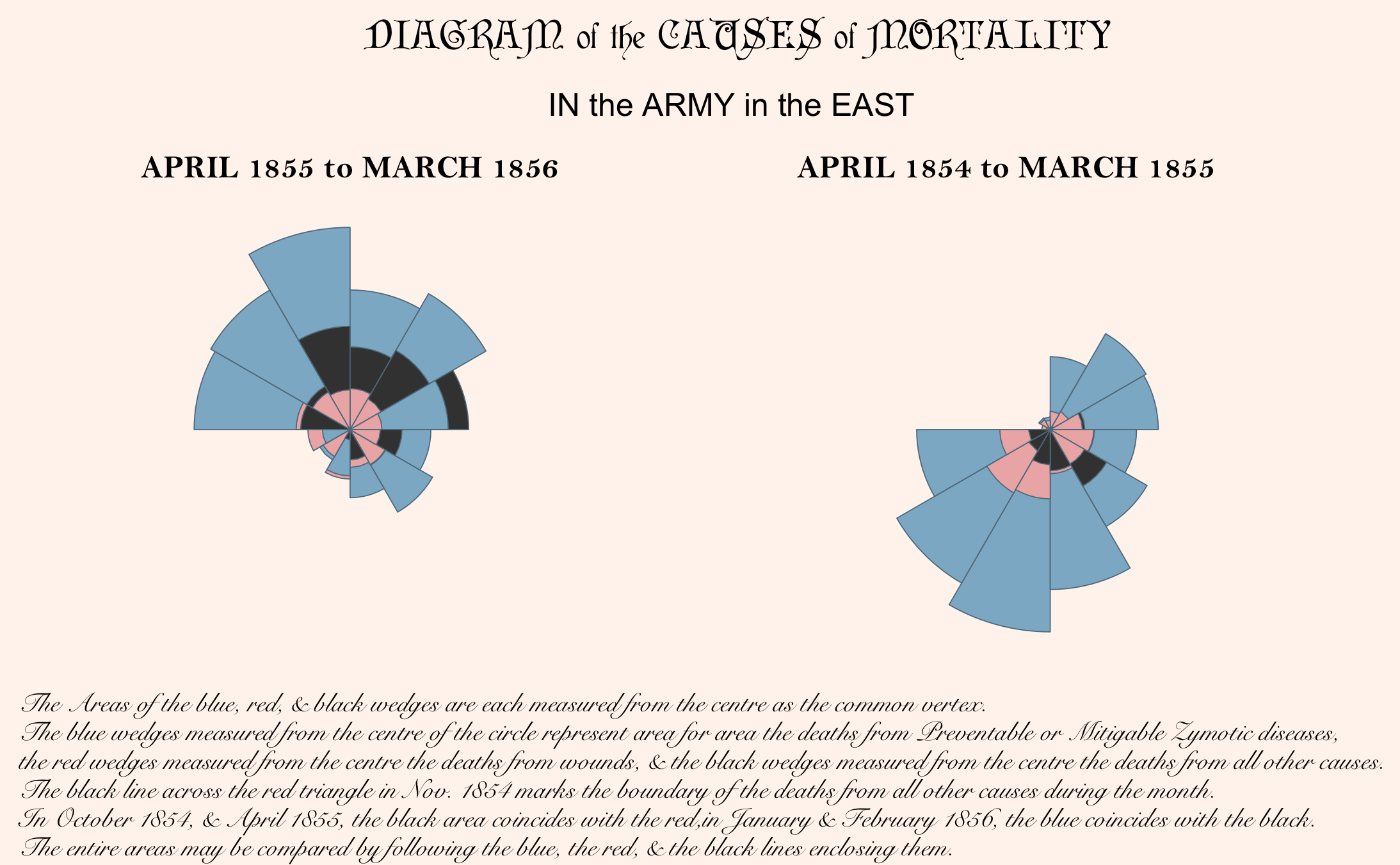
Now the plot appears quite similar to the original, only lacking some annotations to the bars and the black line. Very pretty plotting!
This was a rather novel and pioneering way to communicate statistics back in 1885.
It does however take some effort to understand and read the coxcomb diagram.
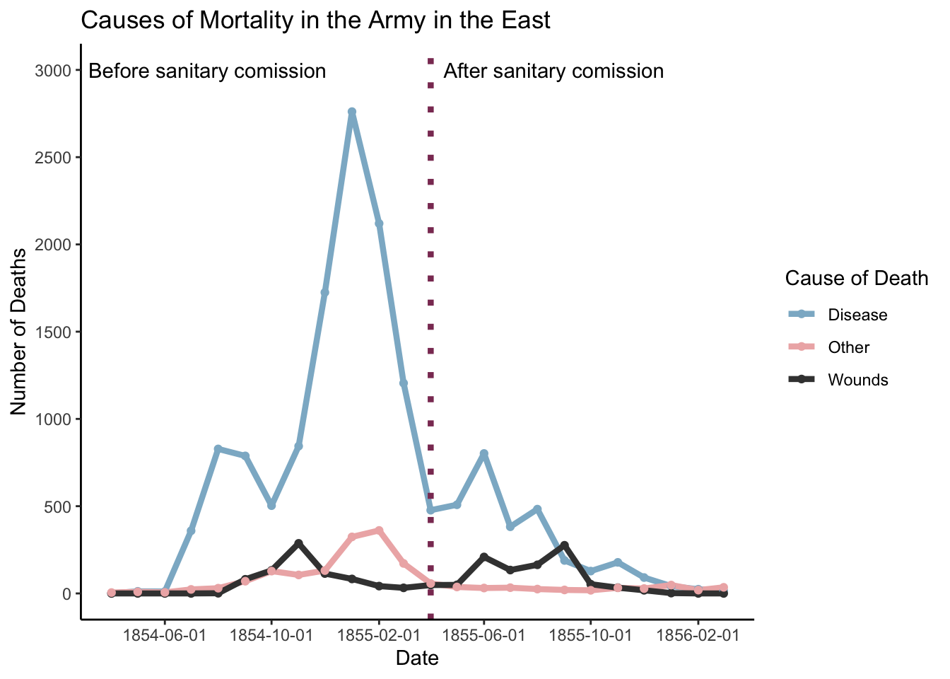
Personally, I think that a simple line-plot over time is a much more efficient way to communicate the message. Also, including a legend in the chart will aid in the readability of the plot. Boring but efficient plotting get the message across.
# Make a line plot with points
# and a vertical line marking the before and after time point
Nightingale.l %>%
  ggplot(aes(x = Date, y = Count, color = `Cause of Death`)) +
  geom_line(size=1.5)  +
  geom_point() +
  scale_color_manual(values =c("lightskyblue3", "rosybrown2", "grey25")) +
  geom_vline(xintercept = as.Date("1855-04-01"), linetype="dotted",
                color = "hotpink4", size=1.5) +
  theme_classic() +
  ggtitle("Causes of Mortality in the Army in the East") +
  ylab("Number of Deaths") +
  annotate("text", x=as.Date("1854-07-20"), y = 3000, label= "Before sanitary comission") +
  annotate("text", x=as.Date("1855-08-20"), y = 3000, label= "After sanitary comission") +
  scale_y_continuous(breaks=seq(0,3000, 500)) +
  scale_x_date(date_breaks = "4 month")
References:
Nightingale, F. (1858) Notes on Matters Affecting the Health, Efficiency, and Hospital Administration of the British Army Harrison and Sons, 1858
Nightingale, F. (1859) A Contribution to the Sanitary History of the British Army during the Late War with Russia London: John W. Parker and Son.
- Posted on:
- October 13, 2022
- Length:
- 8 minute read, 1501 words
- Categories:
- R Statistics Visualizations Clinical science