Calculate Z-Score and plot heatmaps
By Synnøve Yndestad in R RNAseq Statistics Visualizations
June 29, 2022
Z-score
Z-score is a measure for how values deviates from the mean in a given population.
A value with z-score = 0 is the average value in the data. Negative values is below average, and positive is above.
The formlua for calculating z-score is:
z-score = (x-μ)/σ
x = one observation in the population
μ = the mean of the population
σ = the standard deviation of the population
Calculating this in R can be done by:
library(tidyverse)
# Enter some data and calculate z-score
data <- c(1,5,9,12,14,23)

z_scores <- (data-mean(data))/sd(data)
z_scores
## [1] -1.2620630 -0.7398300 -0.2175971 0.1740777 0.4351941 1.6102183
The final number 23 is 1.6 standard deviations away from the mean.
mean(data)
## [1] 10.66667
Visualize how far above or below average the values are:
par(mfrow=c(1,2))
plot(data, type="b", ylab = "data value")
plot(z_scores, type="b", col="black", ylab = "z score")
abline(h = 0, col = "brown", lty = 4)
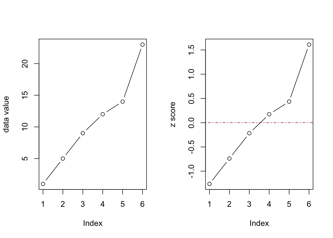
Calculating z-score is a handy way to standardize, or normalize data.
This is frequently used in gene expression studies to visualize heat maps of differential expressed genes.
The DE analysis is performed on normalized counts before log2 and Z-score transformation.
In R, scale() can be used for z-score transformation of large matrices.
Compared with manual Z-score calculation, we get identical results when using scale().
# Manually calculated z-score
z_scores
## [1] -1.2620630 -0.7398300 -0.2175971 0.1740777 0.4351941 1.6102183
# z-score using scale()
scale(data) %>% as.vector()
## [1] -1.2620630 -0.7398300 -0.2175971 0.1740777 0.4351941 1.6102183
Scaling is part of a normalization approach to be able to compare variance between samples.
scale() is performed column-wise.
In a matrix of gene expression data, the matrix must be transposed before and after z-score transformation if you want to compare gene expression between samples.
This will scale the expression of each gene compared to the mean of the expression in the population.
Doing scale on the columns will compare the expression of the gene compared to the other genes within the sample.
For genes in columns and samples in rows, use:
scale(data)
For genes in rows and samples in columns, use:
t(scale(t(data)))
Z-Score normalization with gene expression data:
Here is a demonstration of z-score normalization using gene expression from the airway dataset. The airway data set is available on Bioconductor.
Get the airway dataset
library(airway)
data(airway)
airway
## class: RangedSummarizedExperiment
## dim: 64102 8
## metadata(1): ''
## assays(1): counts
## rownames(64102): ENSG00000000003 ENSG00000000005 ... LRG_98 LRG_99
## rowData names(0):
## colnames(8): SRR1039508 SRR1039509 ... SRR1039520 SRR1039521
## colData names(9): SampleName cell ... Sample BioSample
Extract the count matrix
airway.matrix = assay(airway)
# matrix dimension before removing low count genes
dim(airway.matrix)
## [1] 64102 8
By removing low count genes, the mean variance can be estimated more reliable.
Therefore, genes with 0 counts should be removed for some applications.
# Remove genes with 0 counts
# Sett genes to keep, all genes that are not expressed to be removed
keep <- rowSums(airway.matrix) > 1
airway.matrix <- airway.matrix[keep,]
# Check dimensions
dim(airway.matrix)
## [1] 29391 8
Do log2 transform the count matrix to get normal distributed data before scaling and calculate z-score:
scale(log2(airway.matrix+1)) %>% head()
##                 SRR1039508 SRR1039509  SRR1039512 SRR1039513 SRR1039516
## ENSG00000000003  1.1260901  1.0208946  1.15821433  1.0901426  1.2602939
## ENSG00000000419  0.9916230  1.0714161  1.03630532  1.0488761  1.0238041
## ENSG00000000457  0.7814606  0.7483022  0.72915287  0.7529099  0.7121244
## ENSG00000000460  0.2582945  0.2647380  0.06166199  0.1873347  0.3058427
## ENSG00000000938 -1.2212054 -1.1974507 -0.87556058 -1.1439277 -1.0090925
## ENSG00000000971  1.6893080  1.7850331  1.85914197  1.9600613  1.8952581
##                 SRR1039517 SRR1039520 SRR1039521
## ENSG00000000003  1.1574578  1.2089940  1.0829765
## ENSG00000000419  1.0631139  0.9851562  1.0406101
## ENSG00000000457  0.7558361  0.7730355  0.7564559
## ENSG00000000460  0.1806572  0.3666383  0.2817005
## ENSG00000000938 -1.2724024 -1.2215628 -1.1888027
## ENSG00000000971  1.9797589  1.9052498  2.0258340
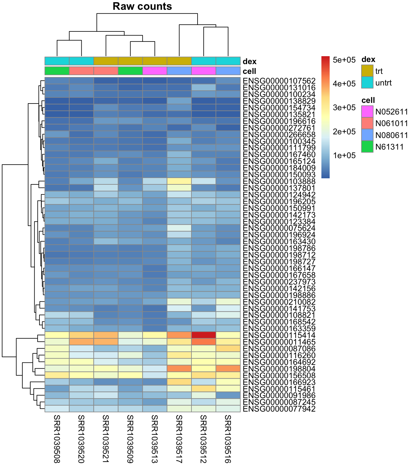
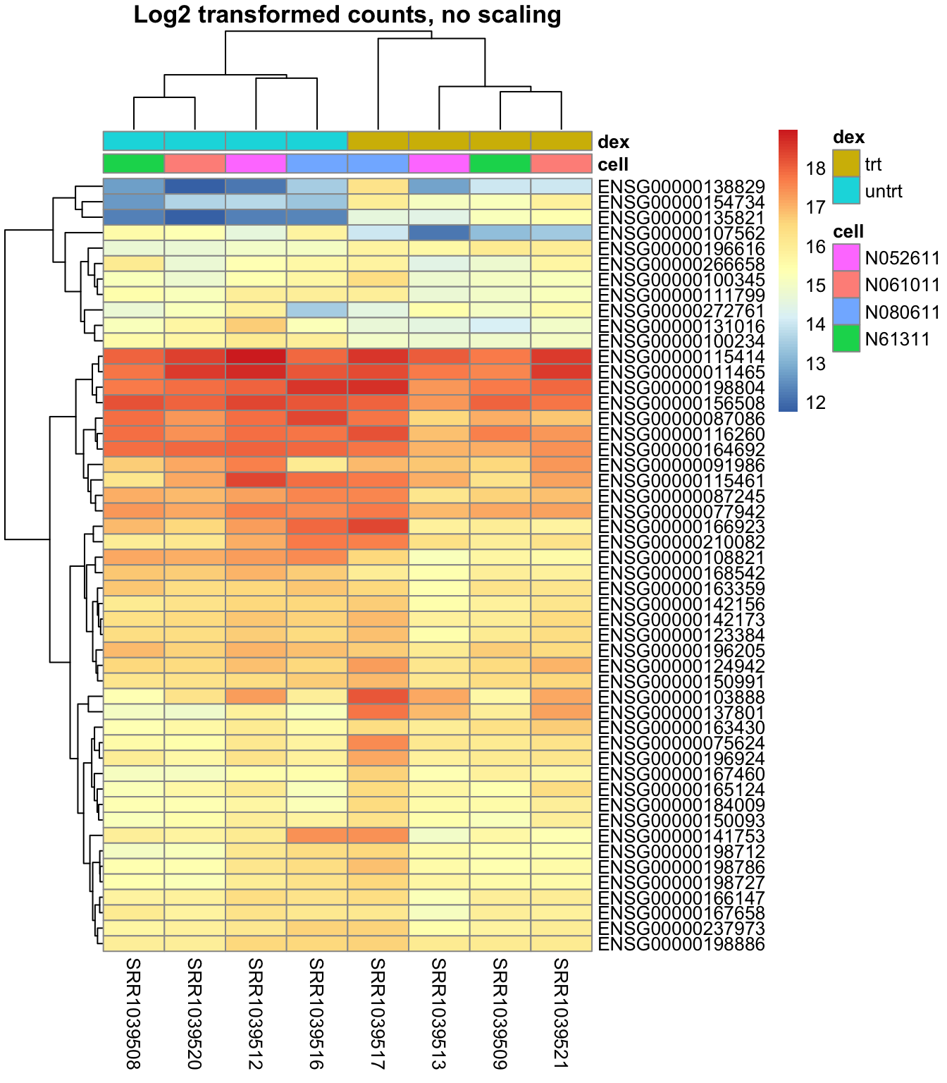
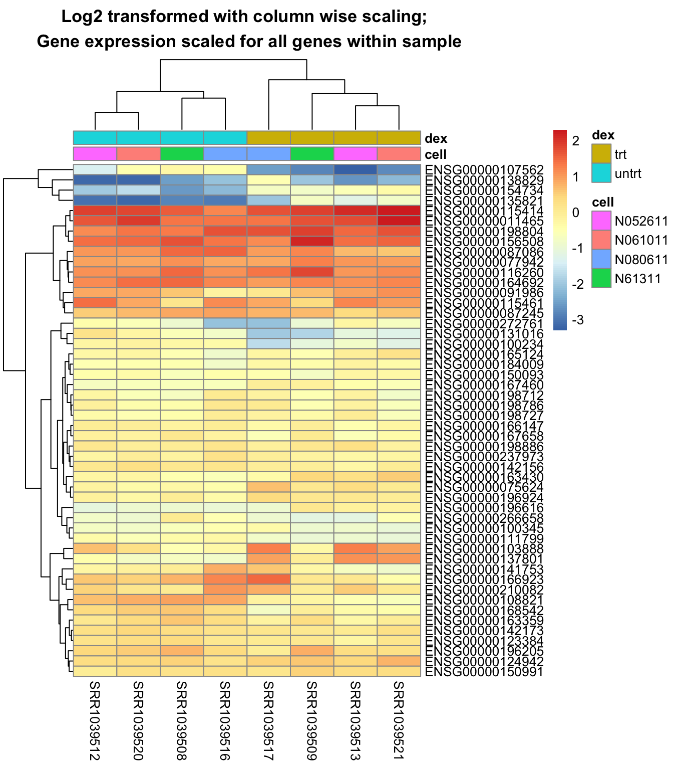
Plotting heatmap
Plotting heatmap with and without log2 normalization, and also plotting when scaling with and without transposing the matrix is a nice visual demonstration of what happens to the data during z-score scaling.
Observe the difference in the heatmap when plotting the data with and without log2 normalization, and scaling with and without transposing the matrix.
# Get metadata for heatmap
metadata = as.data.frame(colData(airway))
# Extract genes with highest variance
topVarGenes <- order(-rowVars(assay(airway)))[0:50]
mat <- assay(airway)[ topVarGenes, ]
# The count matrix has samples in columns, and genes in rows
mat %>% head()
##                 SRR1039508 SRR1039509 SRR1039512 SRR1039513 SRR1039516
## ENSG00000166923     126514      64824     156189      59216     247345
## ENSG00000115414     260262     213986     513766     273878     252667
## ENSG00000011465     219586     191767     422752     214062     293318
## ENSG00000198804     210138     213952     265361     169551     397791
## ENSG00000115461      74051      79611     328753     137165     241640
## ENSG00000087086     236805     138524     236361      95045     343728
##                 SRR1039517 SRR1039520 SRR1039521
## ENSG00000166923     336864      98504      56549
## ENSG00000115414     399841     345651     370450
## ENSG00000011465     313112     378834     372489
## ENSG00000198804     401539     233051     248032
## ENSG00000115461     216484     145858     148389
## ENSG00000087086     229323     167067     114257
Plot the heatmap using pheatmap() of un-normalized raw counts:
pheatmap::pheatmap(mat,
                   annotation = select(metadata, cell, dex),
                                       main = "Raw counts")
Plot a heatmap with the data log2 transformed to get data that are normal distributed:
pheatmap::pheatmap(log2(mat+1),
                   annotation = select(metadata, cell, dex),
                    main = "Log2 transformed counts, no scaling")
Plot a heatmap with the data log2 transformed, but scaling is performed column wise:
pheatmap::pheatmap(scale(log2(mat+1)),
                   annotation = select(metadata, cell, dex),
                   main = "Log2 transformed with column wise scaling; \n Gene expression scaled for all genes within sample")
Plot a heatmap with the data log2 transformed, and properly scaled row-wise:
pheatmap::pheatmap(t(scale(t(log2(mat+1)))),
                   annotation = select(metadata, cell, dex),
                   main = "Log2 transformed with row wise scaling; \n Individual gene expression scaled between samples")

The last heatmap show the difference in gene expression between samples, while the second last show the difference of gene expression within each sample. So it is important to do the scaling in the desired direction.
- Posted on:
- June 29, 2022
- Length:
- 5 minute read, 927 words
- Categories:
- R RNAseq Statistics Visualizations
- Tags:
- z-score heatmap scale gene expression
- See Also:
- Read and merge multiple files by folder